Client: Meridian Medical Centers
Designer: Aesthetic Brands Studio, Adnan ( www.aestheticbrands.studio )
Project: Brand Identity Design, Style Guide ( Core Brand Identity )
Designer: Aesthetic Brands Studio, Adnan ( www.aestheticbrands.studio )
Project: Brand Identity Design, Style Guide ( Core Brand Identity )
Project Overview:
Meridian Medical Centers partnered with us to build a complete core brand identity—from naming to visual direction. The project included defining the brand’s tone and voice, creating the logo system, developing the color palette, selecting typography, and establishing a concise but robust style guide.
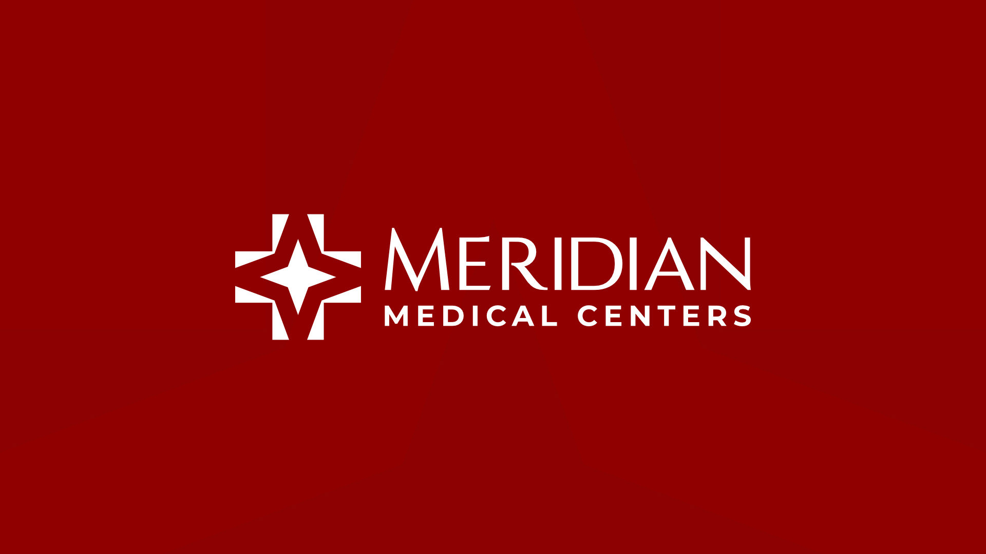
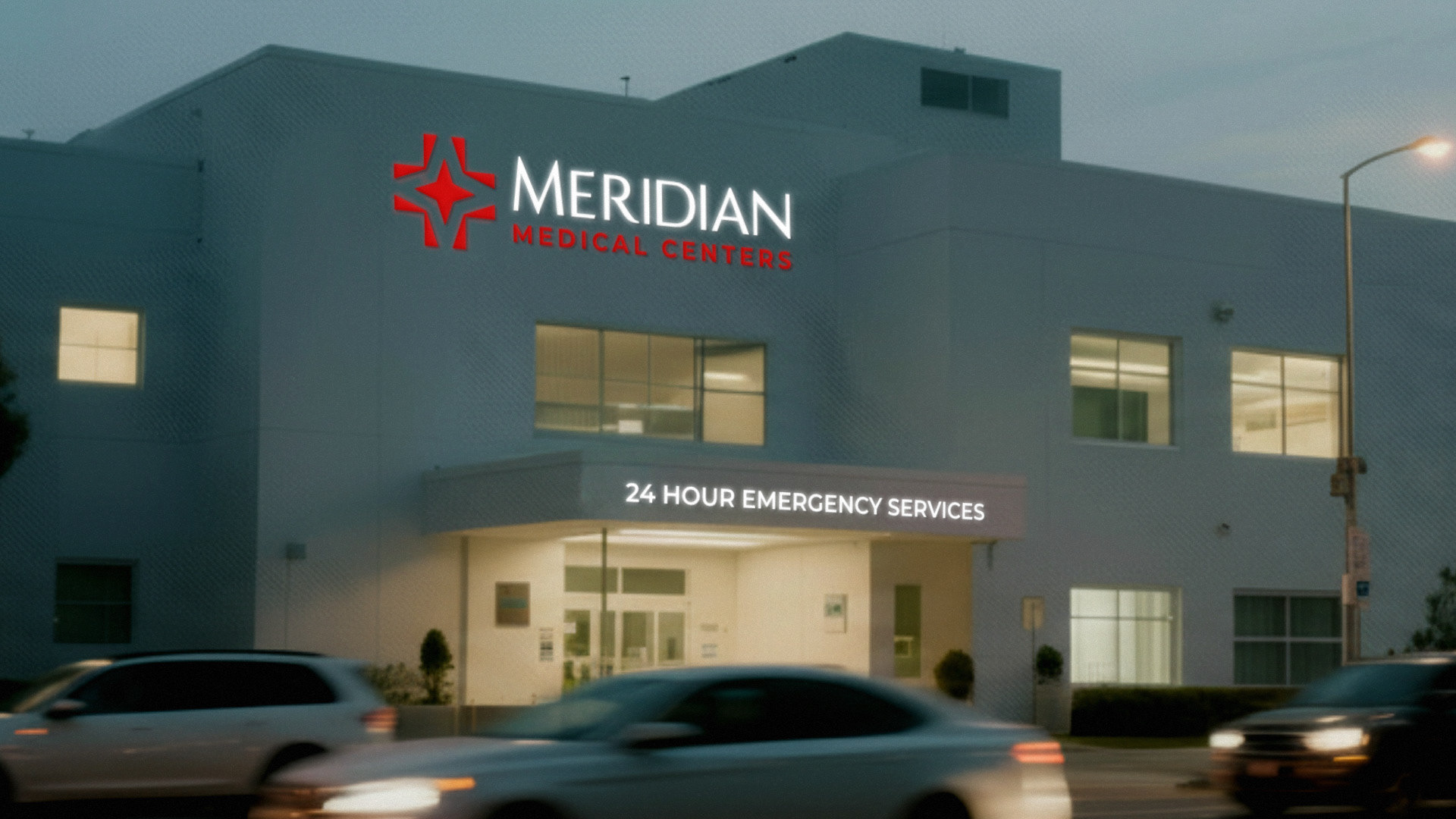
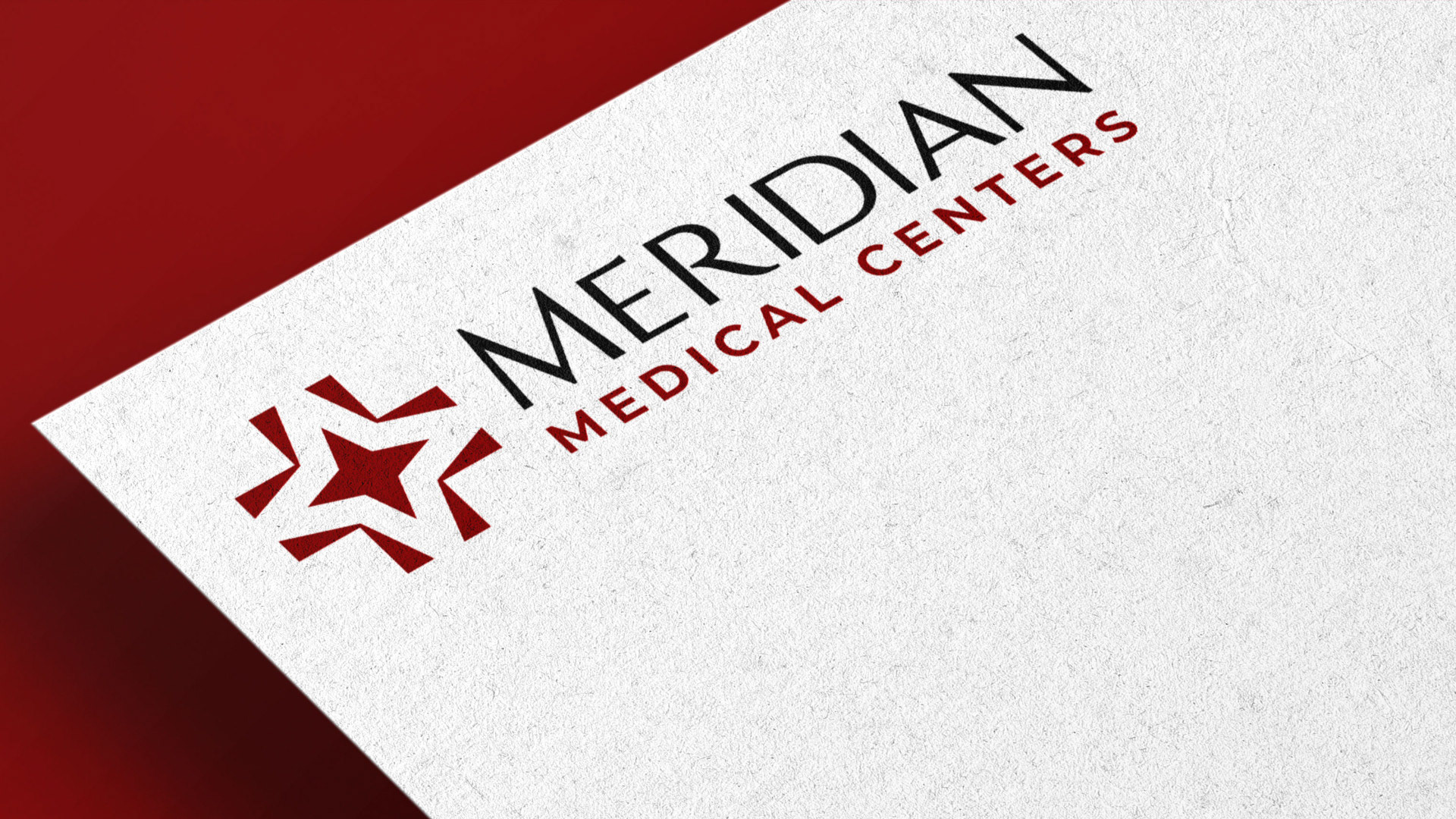
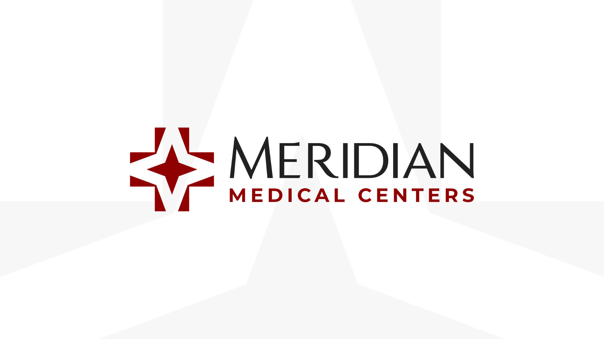
We began by exploring several name options that could communicate trust, direction, and medical expertise. Meridian Medical Centers emerged as the strongest choice, inspired by the alignment of a north star with the medical emergency “plus” symbol—an idea that became the foundation for the brand’s icon.
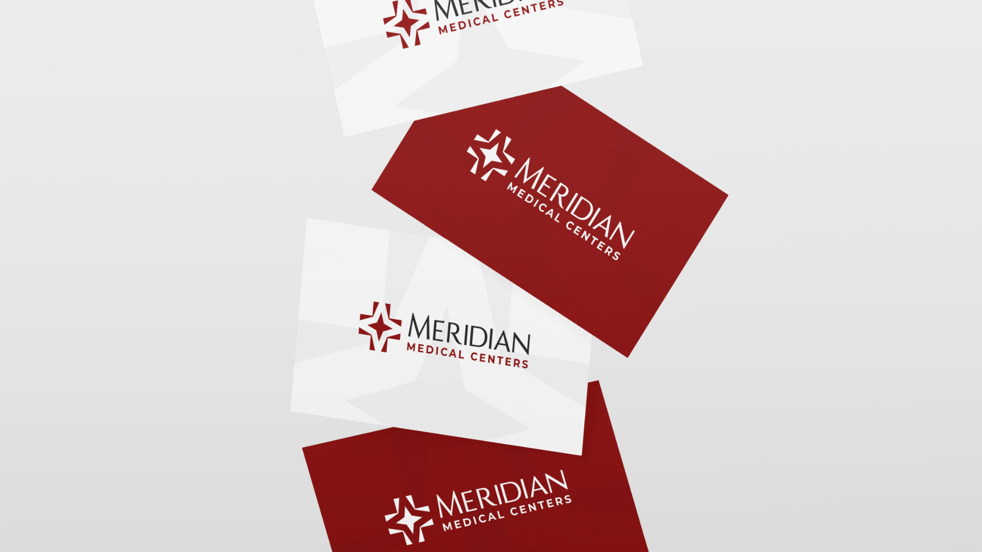
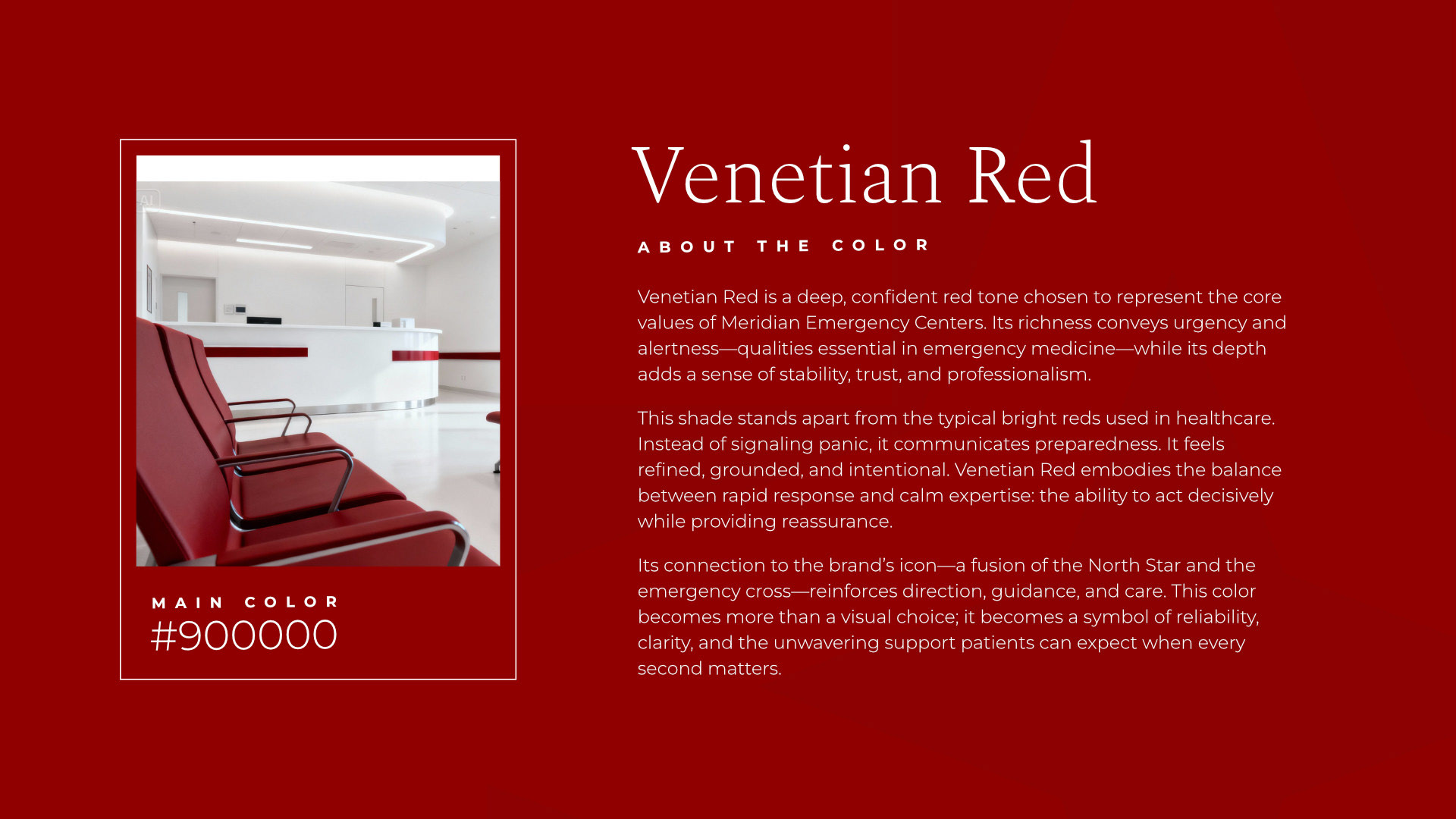
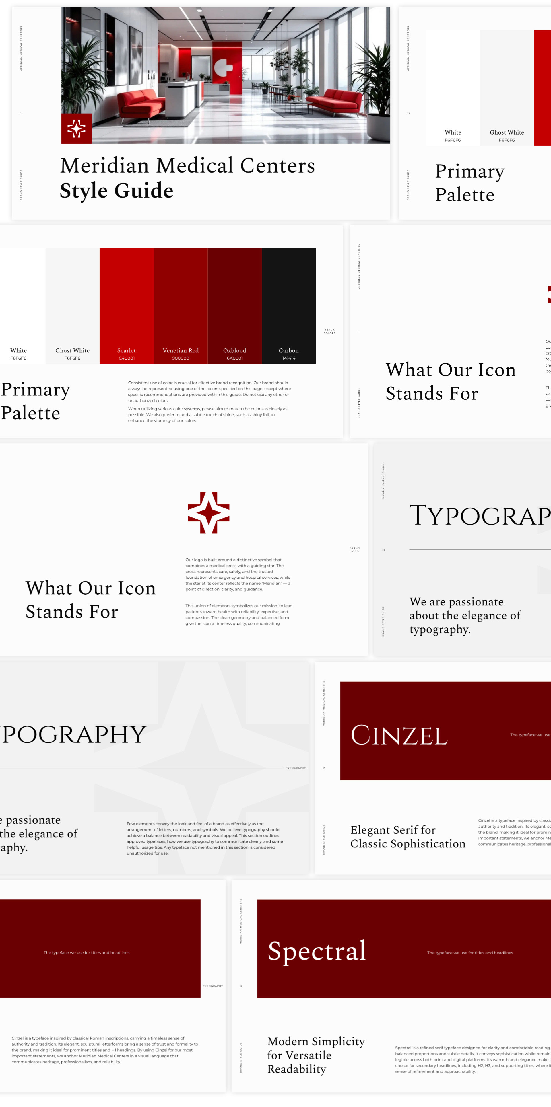
During competitive research, we identified a common visual theme across emergency and urgent-care providers: heavy use of blues and greens. To differentiate Meridian while still staying rooted in the medical space, we proposed a refined red palette. Instead of the typical bright, alarming emergency red, we selected a deeper, more elegant tone—#900000, which we named Venetian Red. Supporting shades were added to provide flexibility across print and digital applications, while maintaining a cohesive and sophisticated look.
About the Client:
Meridian Medical Centers is a modern, patient-focused emergency care provider dedicated to delivering fast, reliable medical treatment without the long wait times of traditional hospital ERs. Their centers are designed to feel clean, calm, and reassuring—combining advanced clinical capabilities with an elevated patient experience.
The organization is led by a team of experienced medical professionals, including Dr. Shane, whose vision and commitment to improving community emergency care played a key role in shaping the brand direction. Dr. Shane was also the point of connection for this project, helping ensure that the visual identity aligned with the center’s mission: accessible, high-quality emergency care delivered with efficiency and compassion.
Through this collaboration, we crafted a brand identity that reflects the professionalism, trust, and modern approach that define Meridian Medical Centers.
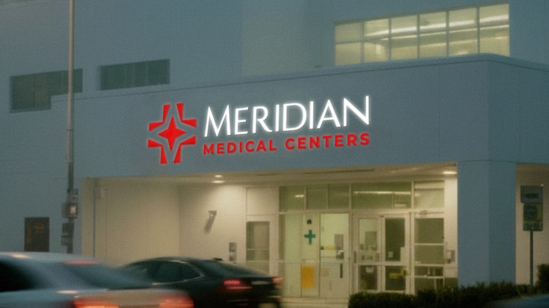
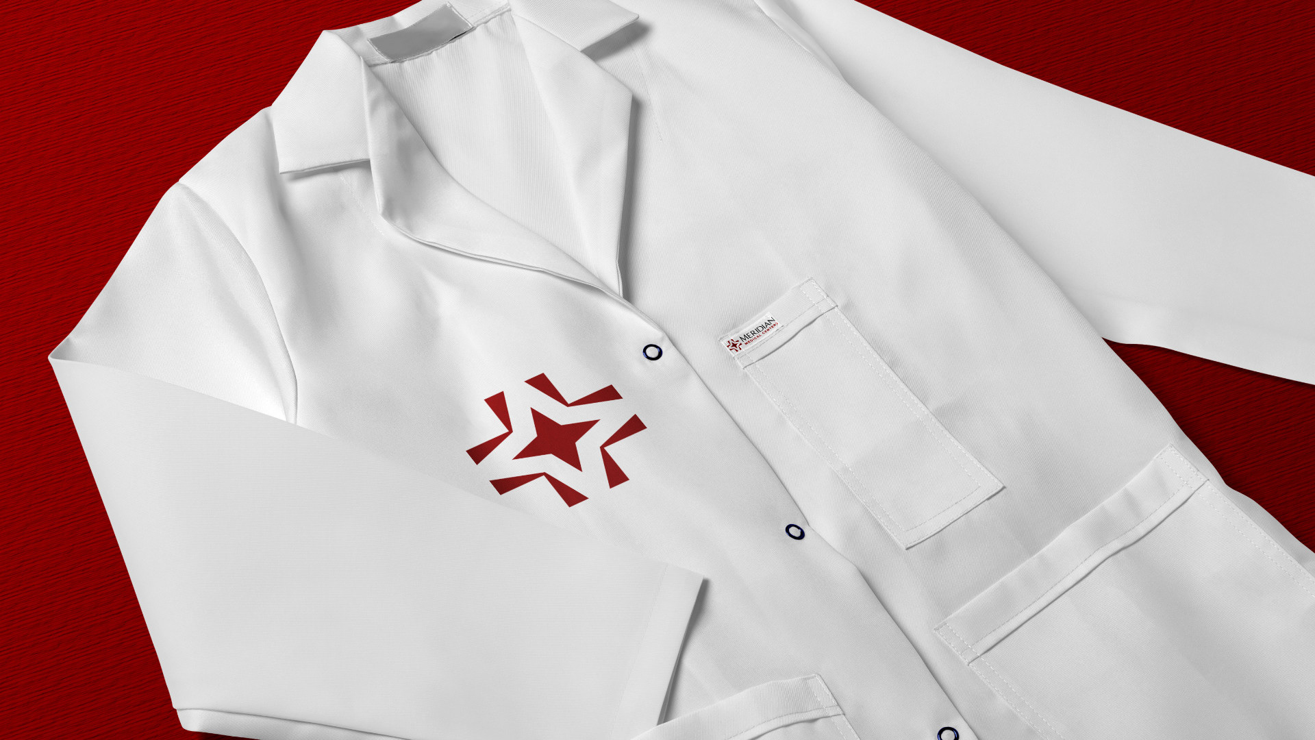
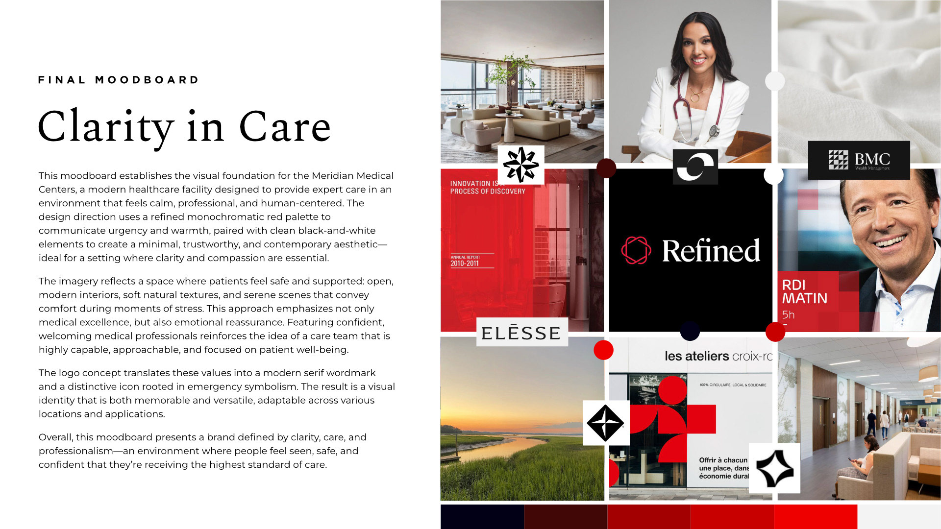
We began the project with an in-depth moodboarding phase to establish the visual style, tone, and overall direction. This early alignment gave us a clear creative foundation, making the branding exploration more focused and efficient. As a result, the concept development moved smoothly, and we arrived at the final brand identity within just a few thoughtful revisions.

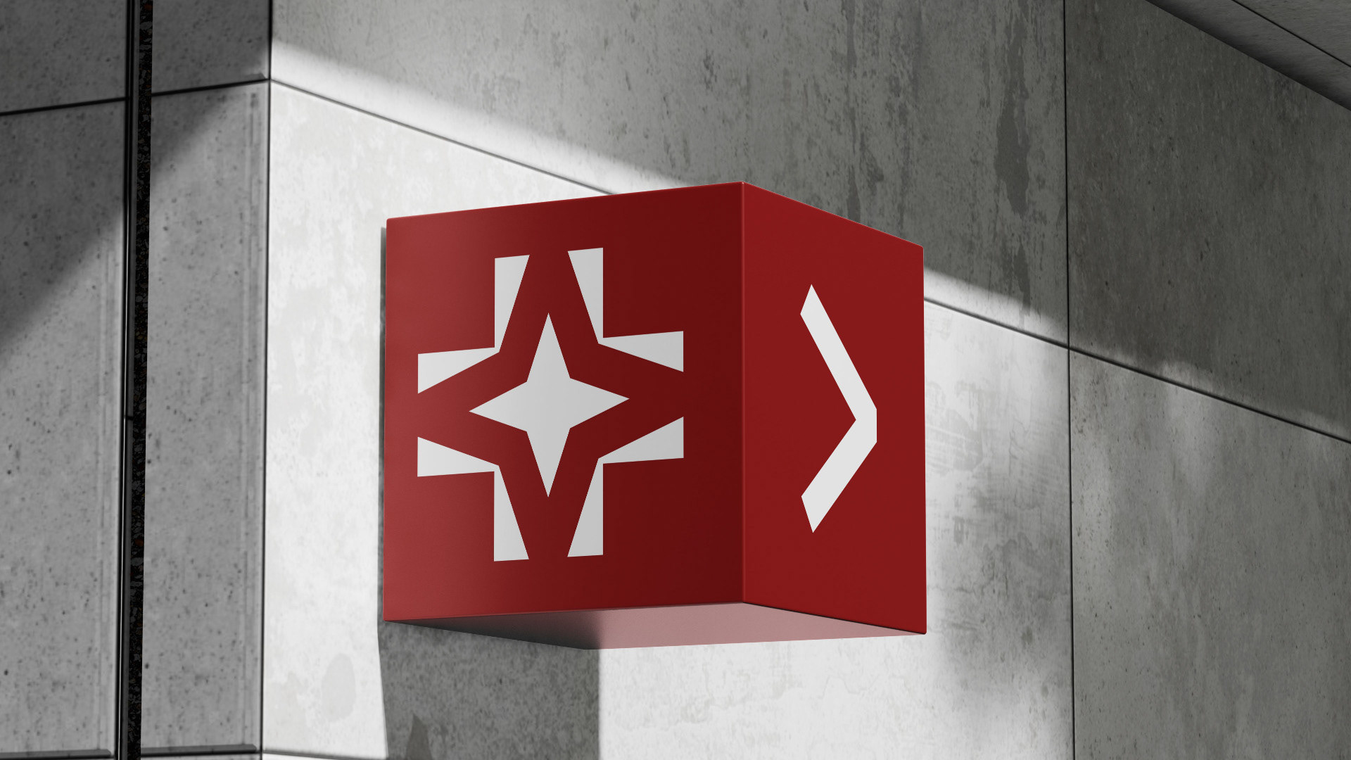
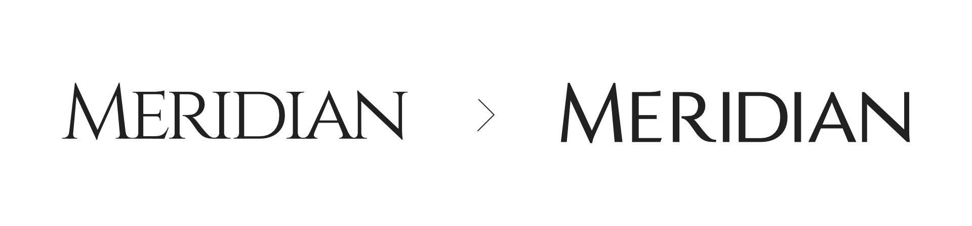
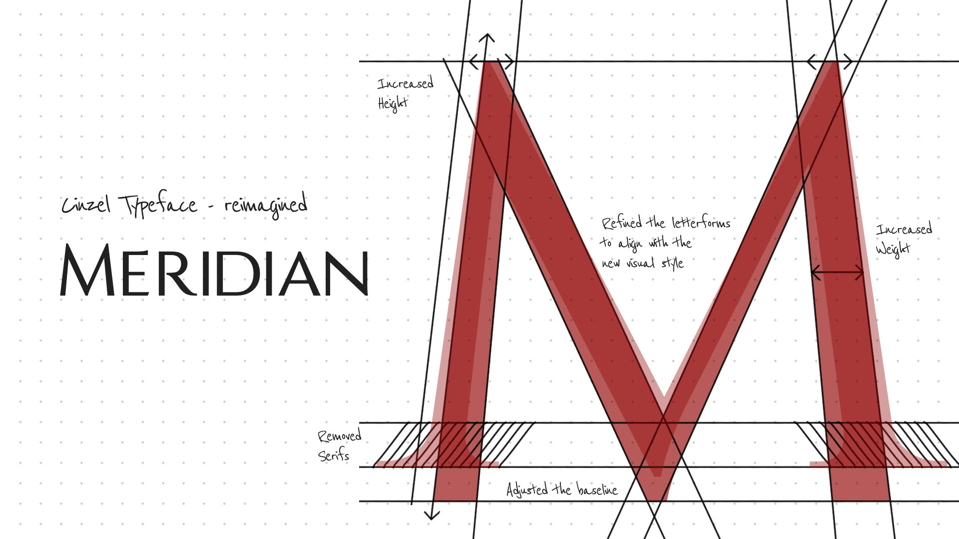
We selected Cinzel as the foundation for the Meridian Medical Centers wordmark. Cinzel is a typeface inspired by classical Roman inscriptions—known for its sharp, elegant serifs, balanced proportions, and sense of stability and tradition. Its refined structure gives it a timeless, trustworthy feel, which aligned well with the values of a modern emergency care provider.
To ensure the typography felt uniquely theirs, we customized and refined the letterforms. Several shapes were adjusted to create a more cohesive rhythm, improve legibility at smaller sizes, and visually connect the wordmark to the geometry of the icon. These modifications allowed the final wordmark to feel both elevated and distinctly tailored to Meridian Medical Centers.