About Hazell Developments: " We are a Midlands based property and land development company keen to get the best result for both our clients and ourselves. Our ethos is to develop property, properly. As a business we are committed to building sustainable homes and supporting local communities. Designing sustainable and ecologically friendly features is a key part of all our developments. We actively support local charities and communities ."
Project:
Branding + Brand Guidelines + Wordpress Website
Branding + Brand Guidelines + Wordpress Website
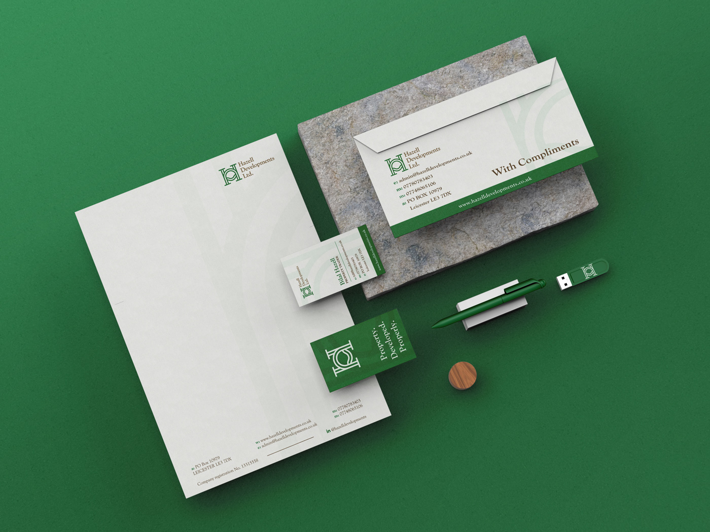
I was hired by Bilal Hazell to make a branding for his land & property development company. We went through Discovery session together and made a list of goals that we want to achieve with branding. Goal was to make brand that will appeal to their partners in professional manner, but also connect with land owners in mid-range market. They didn't want to appeal as only corporate company, but trustworthy and reliable to their mid-range market.
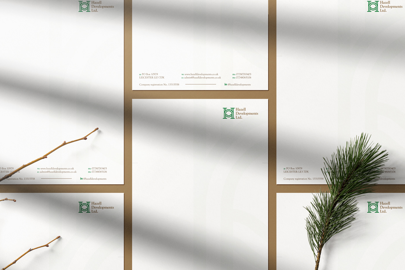
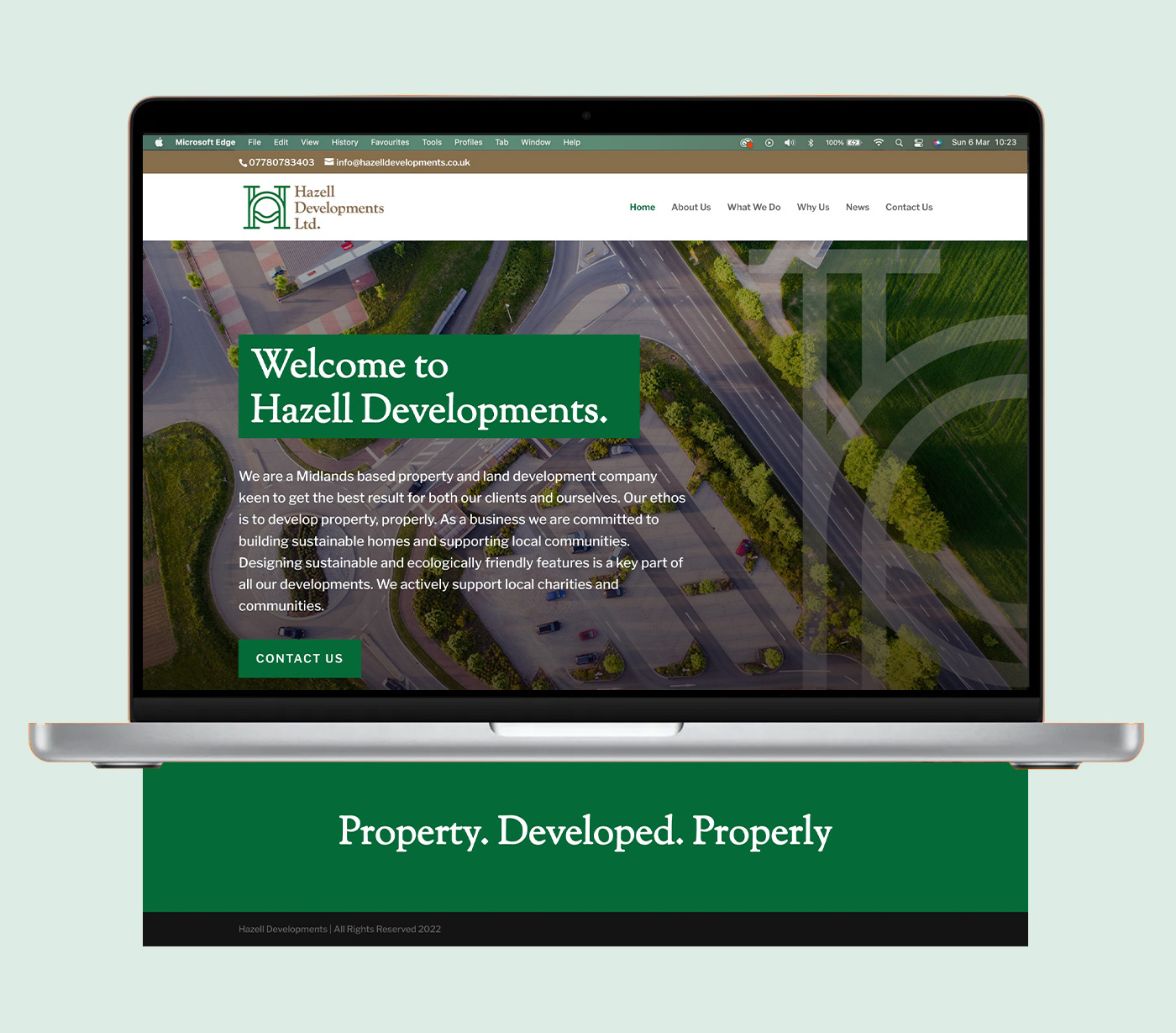

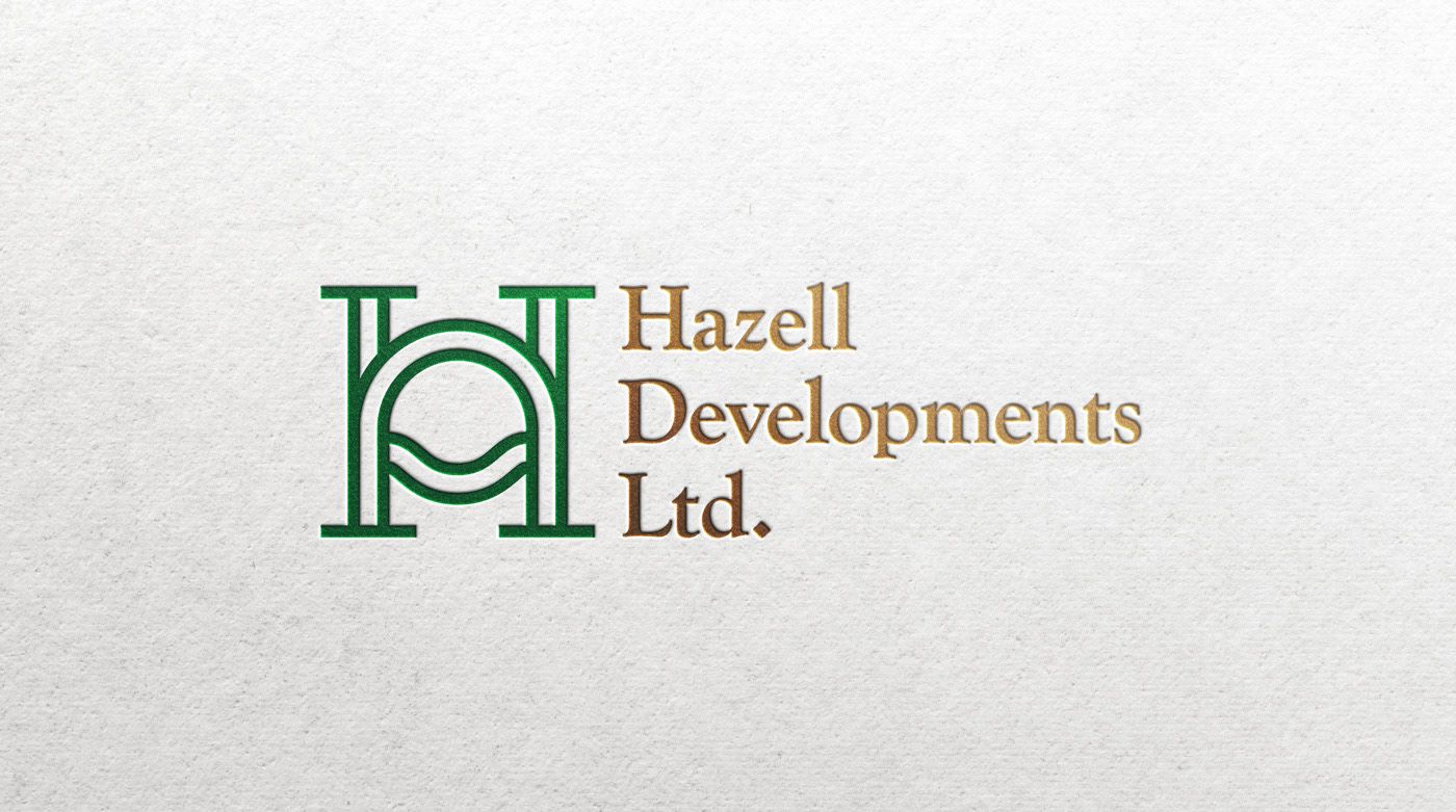

Thinking Behind the project:
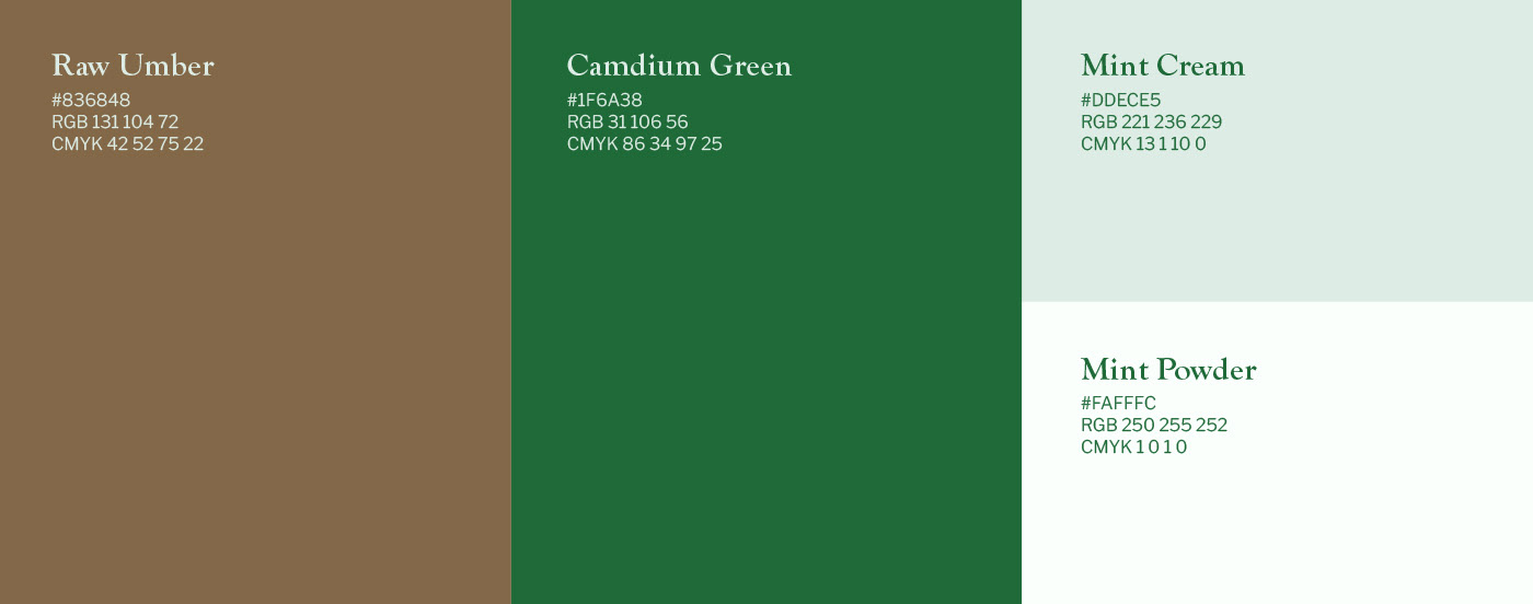
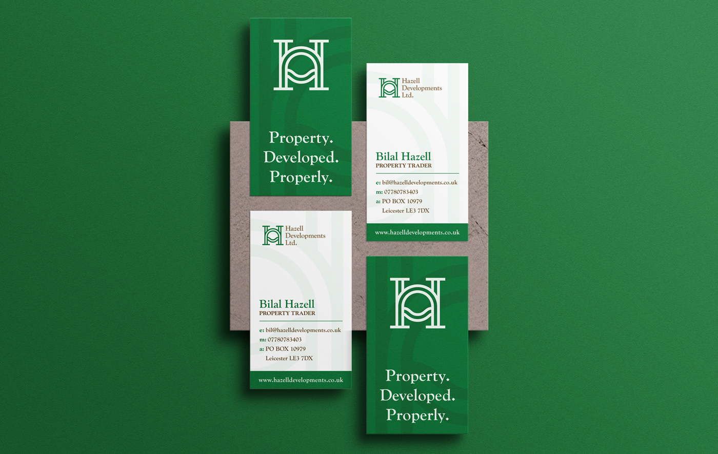
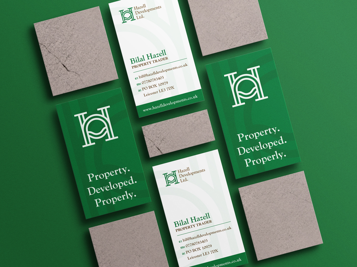
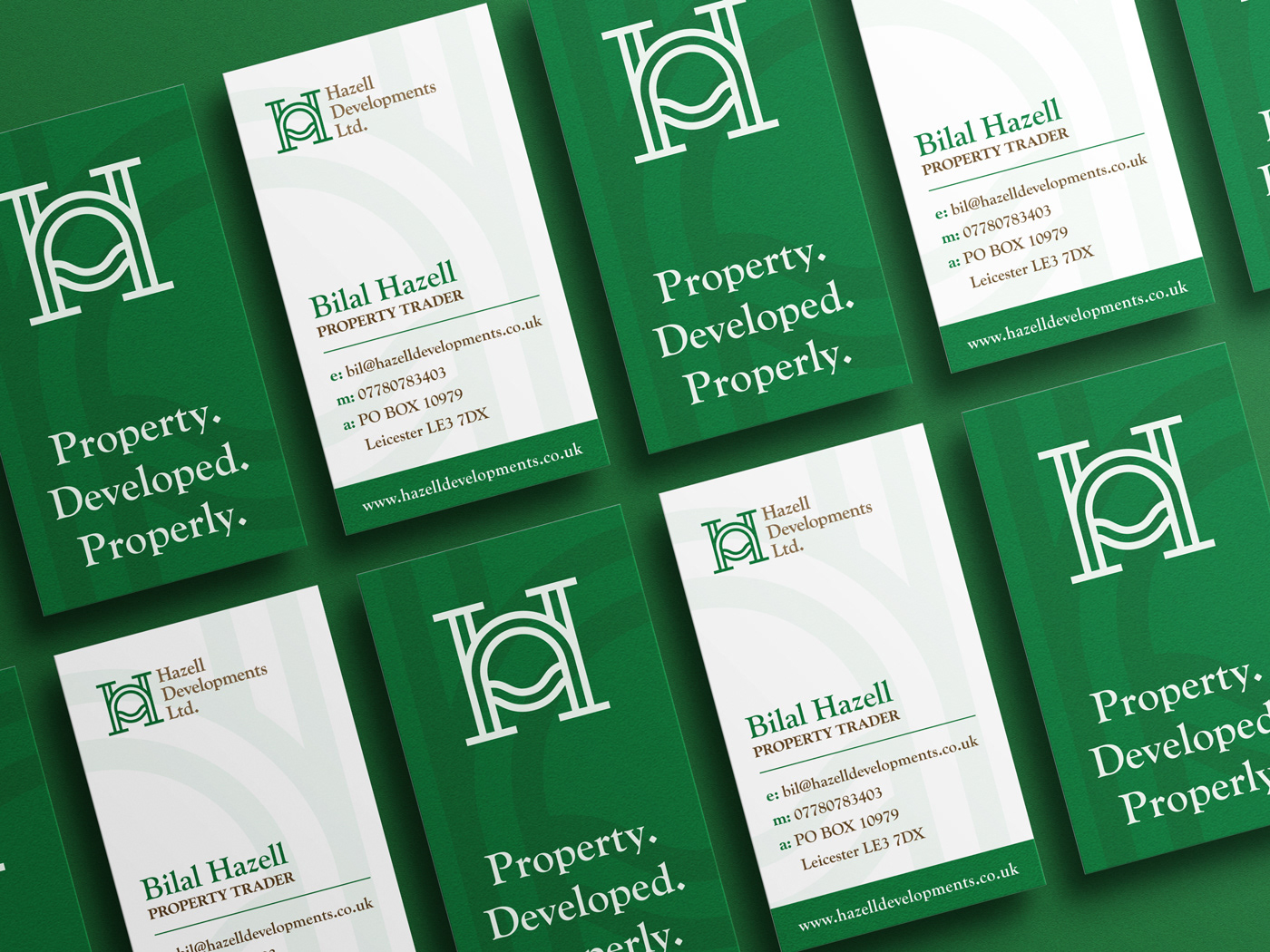
Colors Camdium Green & Raw Umber ( names generated from coolors.co ) were perfect fit our idea. Both colors are representing earth / ground, for a business which care for ecology and sustainability , finding connection with nature was a key for a success for in this project. Both colors fit really well in corporate aspect of the company as well and helps company to look professional within group of their business partners.
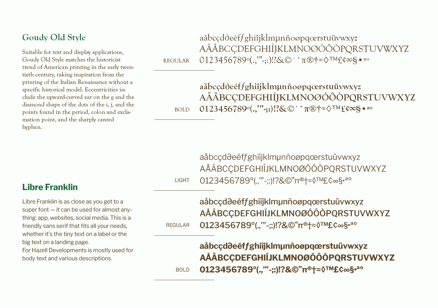
Search for friendly & professional font ended up with Goudy Old Style. As a serif font, it looks professional, shows tradition and heritage of the company, and helps putting Hazell Developments closer to a level of their competitors which are longer in the business. Rounded edges on Goudy Old Style makes for friendly and perfect fit to appeal to their customers in mid-range market.
Goudy Old Style is primarily being used for titles and headlines, so Libe Franklin was a choice for secondary font, and font which is being used for all text / copy. Libre Franklin is as close as you get to a super font - It can be used for almost anything: app, websites, print... This is a friendly sans serif that fits all needs, whether it's the tiny text on a label or the big text on a landing page.
Search for friendly & professional font ended up with Goudy Old Style. As a serif font, it looks professional, shows tradition and heritage of the company, and helps putting Hazell Developments closer to a level of their competitors which are longer in the business. Rounded edges on Goudy Old Style makes for friendly and perfect fit to appeal to their customers in mid-range market.
Goudy Old Style is primarily being used for titles and headlines, so Libe Franklin was a choice for secondary font, and font which is being used for all text / copy. Libre Franklin is as close as you get to a super font - It can be used for almost anything: app, websites, print... This is a friendly sans serif that fits all needs, whether it's the tiny text on a label or the big text on a landing page.