Client: Surface + Soul Aesthetics ( Lacey Calhoun )
Designer: Aesthetic Brands Studio, Adnan ( www.aestheticbrands.studio )
Project: Brand Identity Design, Style Guide ( Core Brand Identity )
Designer: Aesthetic Brands Studio, Adnan ( www.aestheticbrands.studio )
Project: Brand Identity Design, Style Guide ( Core Brand Identity )
Project Overview:
Surface + Soul Aesthetics is a full brand identity built from the ground up: name, visual language, and all. The core philosophy is simple but quietly profound: true beauty isn't about transformation. It's about revealing what was always there. The brand lives at the intersection of skin and self, treating both the surface and the soul with equal care.
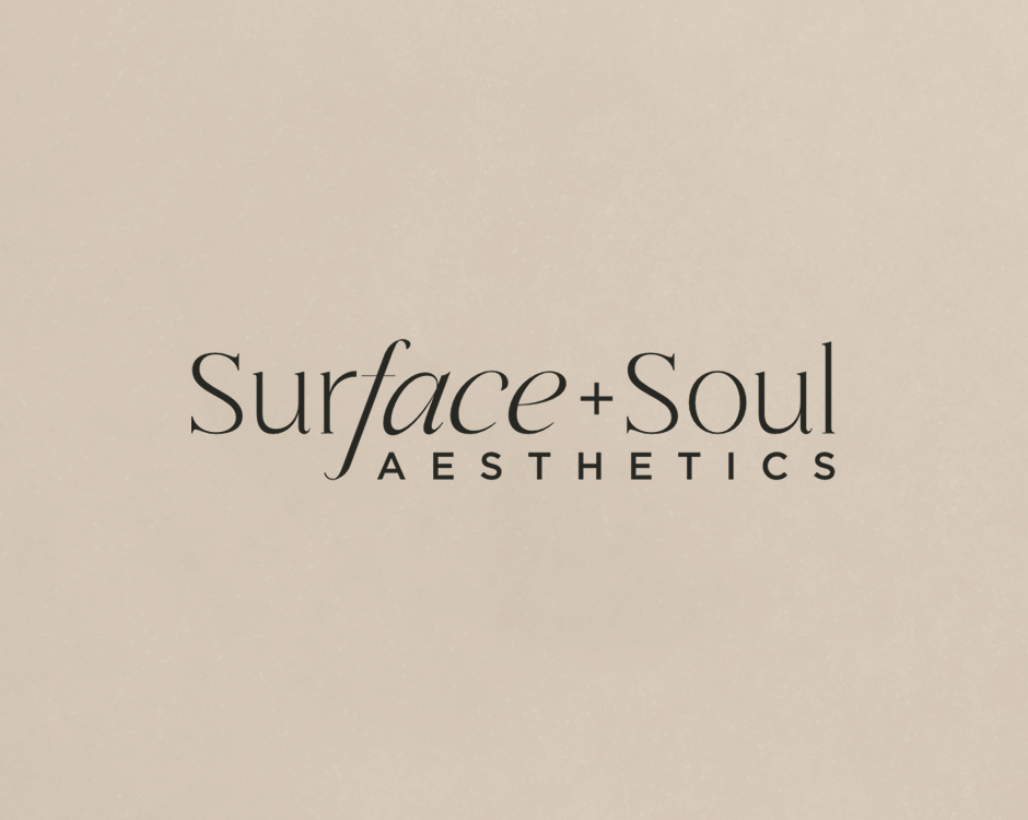
The name itself does a lot of the heavy lifting. Surface nods to the skin, the craft of aesthetic medicine, while Soul anchors the emotional depth behind the work. But the real detail is hidden in plain sight: surface holds the word face within it, a subtle nod we made impossible to ignore in the logo. That kind of intentional layering is what gives the brand its personality, refined, but with something to discover.
About the Client:
Lacey Calhoun came to the project at an exciting and vulnerable moment, the very beginning. No name, no visual identity, just a clear sense of who she was and the kind of experience she wanted to create for her clients. She already had a loyal blog readership, which told us everything: her audience trusted her, felt close to her, and kept coming back. The goal wasn't to reinvent. It was to elevate.
From the first call, the direction was there between the lines. We explored, proposed, and refined until Surface + Soul Aesthetics felt inevitable, the kind of name that sounds like it couldn't have been anything else.
Moodboard & Creative Direction
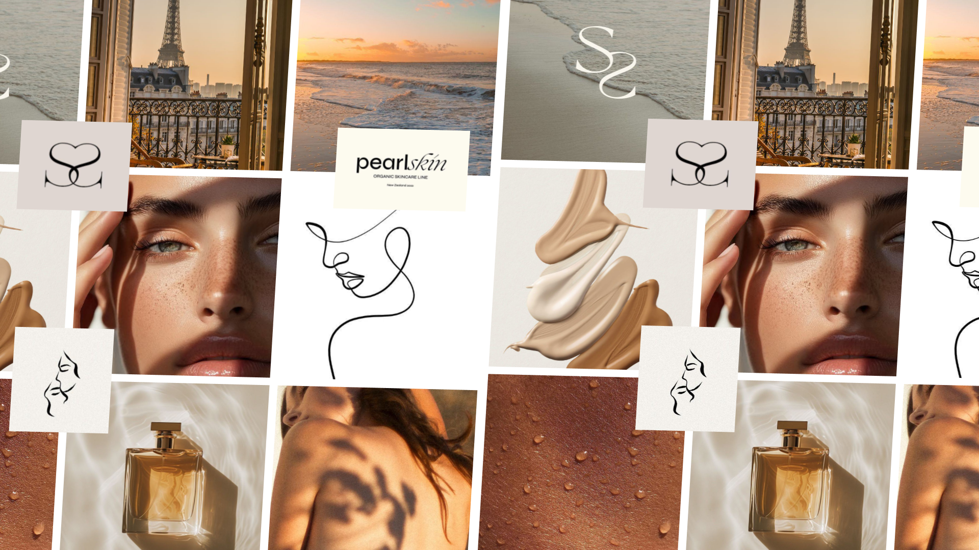
Every project starts with a moodboard. Before a single design decision is made, this is where the work really begins, defining the direction, establishing the brand feel, and aligning on a visual language that will carry through everything that follows. It removes guesswork and creates a shared foundation to build from.
For Surface + Soul Aesthetics, the chosen direction leans into a raw, minimal expression of beauty, inspired by the honesty of bare skin and the quiet confidence of authenticity. The mood is modern, sensual, and deeply human. Stripped back, yet refined.
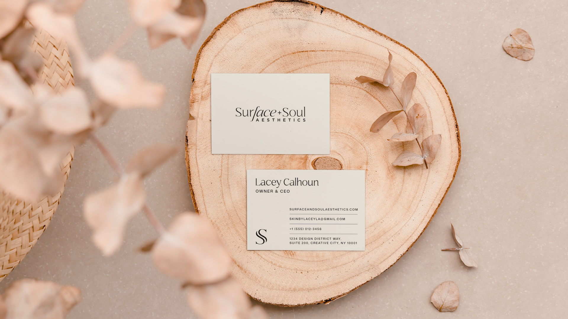
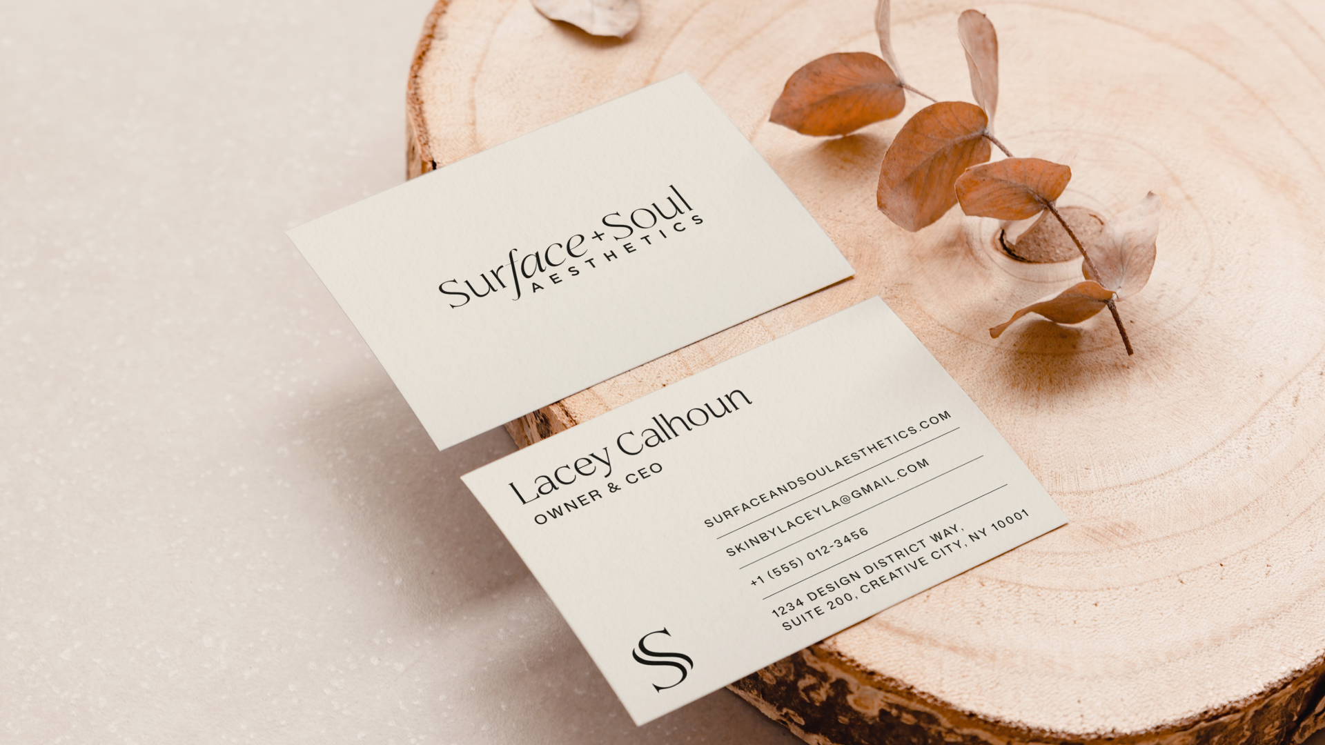
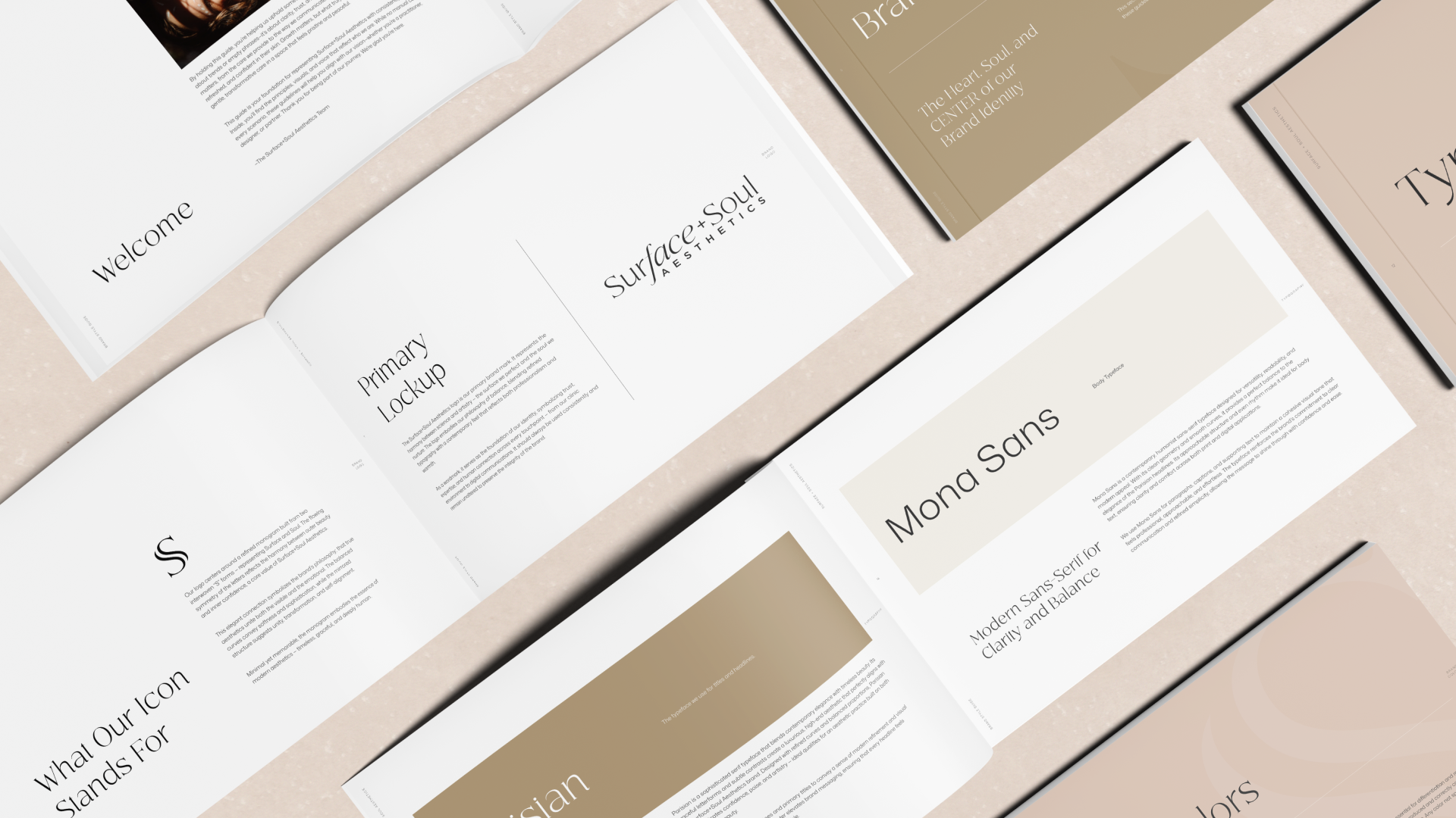
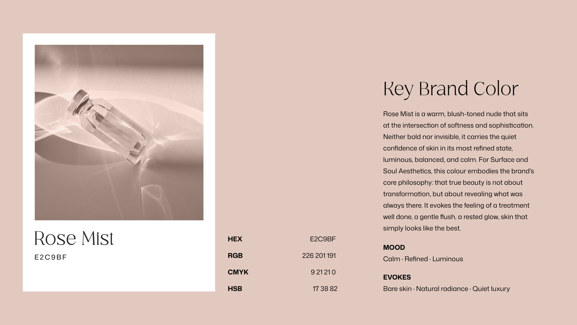
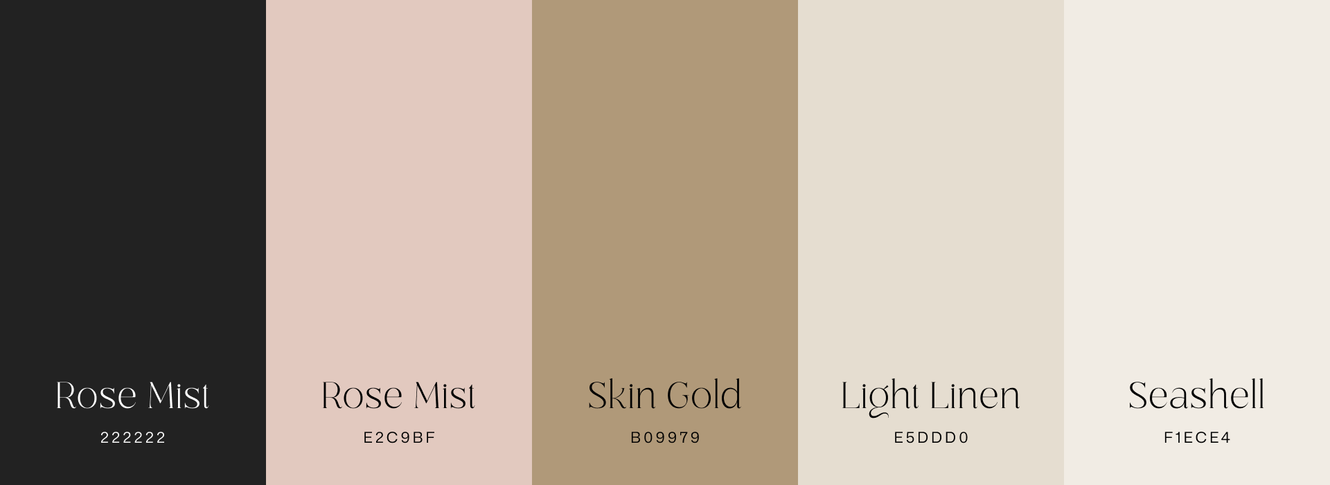
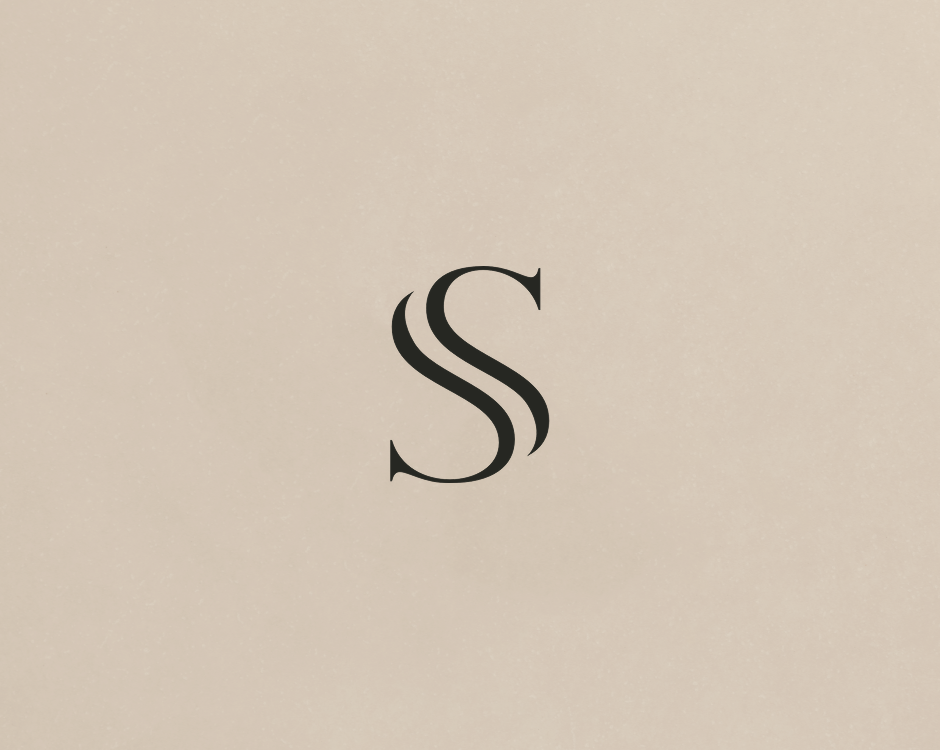
Colors are drawn from skin tones, warm earth hues, and subtle neutrals, reflecting closeness and honesty while retaining sophistication. At the heart of the identity sits the SS monogram, conceived as a fluid, sculptural symbol of duality, two forms working together as one, with a nod to two faces in abstract form. Typography stays modern and minimal, complementing the mark with clarity and elegance.
The result is a brand that feels both elevated and approachable, conveying care, authenticity, and elegance through a disarming simplicity that never tries too hard.